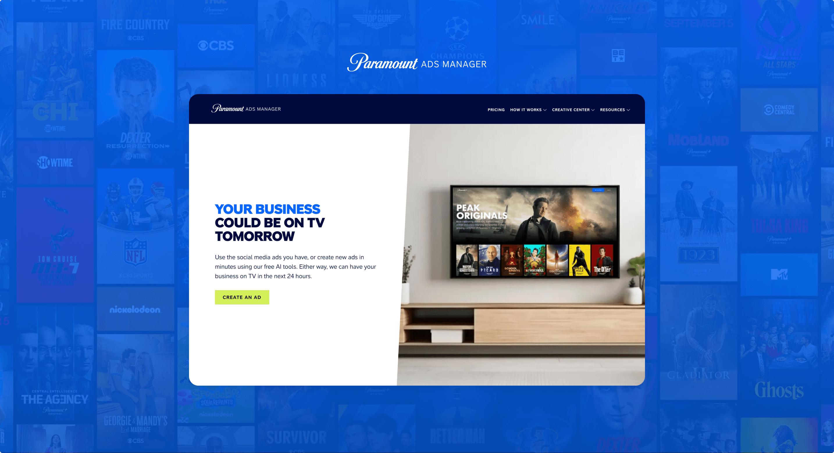
Paramount Ads Manager is a self-serve advertising platform that enables businesses to create and run ads on Paramount+. The platform supports a wide range of advertisers—from small and medium-sized businesses (SMBs) launching their first streaming campaign to large agencies managing high-volume media buys.
While the platform serves all advertiser types, the primary focus of this work was SMBs. These users often have limited experience with advertising, fewer resources, and a greater need for guidance.
Creating an ad campaign on Paramount+ is not inherently complex—but for many small-to-medium businesses, it can feel that way.
SMB advertisers often come to the platform with the idea shaped by traditional linear and cable TV advertising: high costs, long timelines, agency involvement, and complex production requirements. This mental model creates an initial barrier, making the idea of “advertising on TV” feel intimidating, risky, and out of reach—all before a user even begins the campaign creation process.
The challenge was to design an experience that reduced this perceived complexity and anxiety, met users where they were, and built confidence throughout the flow—while still supporting the flexibility and control expected by more advanced advertisers. At the same time, the experience needed to preserve the sense of excitement and accomplishment that comes from successfully launching an ad and seeing it appear on TV.
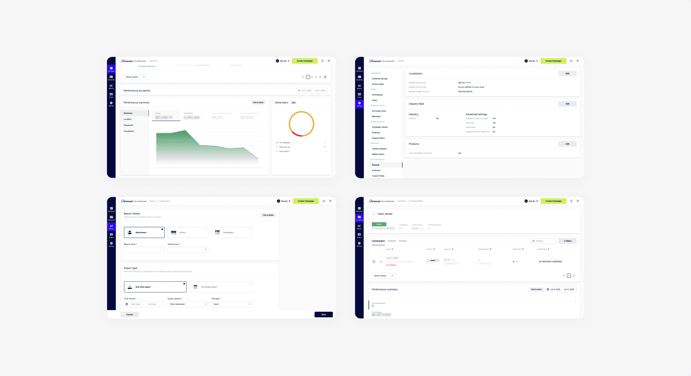
As the sole Product Designer on the team, I led the end-to-end design efforts across the Paramount Ads platform. My work spanned the full product lifecycle, including discovery, user flows, wireframes, high-fidelity UI, and design handoff.
I collaborated closely with Product Managers and Engineers, as well as internal partners in Sales and Customer Success, to ensure solutions addressed real user pain points while aligning with business goals and operational constraints. Through this collaboration, I helped shape a platform that balances self-serve simplicity with the flexibility required by larger advertisers.
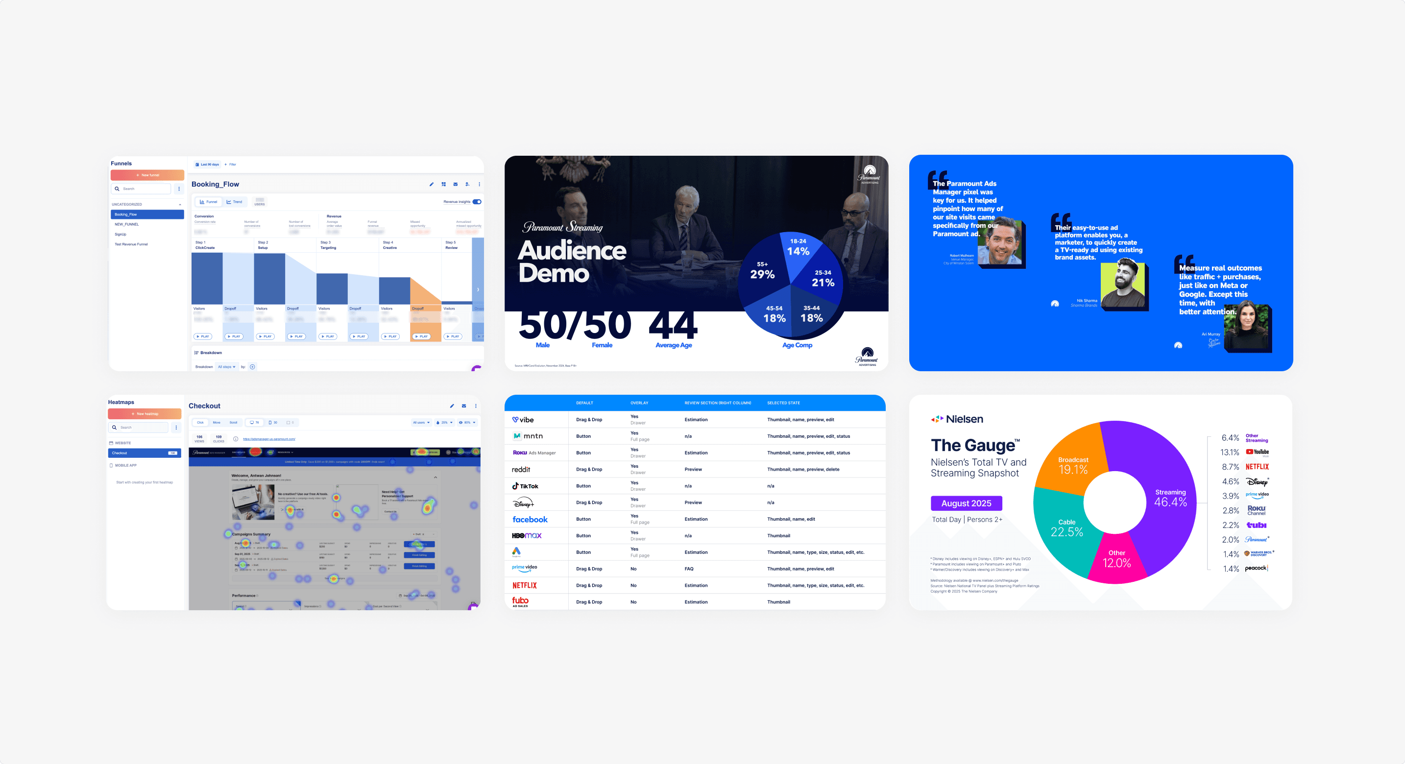
To understand where advertisers were struggling, I partnered with our data analytics team and internal stakeholders to analyze both quantitative and qualitative insights.
Quantitative Insights
Funnel analysis revealed the largest drop-off during the “Add a Creative” step.
Mobile sessions accounted for a significant portion of overall traffic, yet conversion rates were substantially lower compared to desktop.
Users who entered the creative step but didn’t complete it rarely returned to finish their campaign.
Qualitative Insights
SMBs wanted simpler targeting tools and clearer explanations of where and how their ads would appear.
Many lacked existing video assets and relied heavily on our AI-powered video generator.
Users needed more reassurance, feedback, and progress indicators, especially during moments that felt “high risk,” like uploading or creating a video ad.
Together, these findings revealed that users weren’t abandoning the platform due to lack of interest—but due to uncertainty, intimidation, and unmet expectations around how “TV advertising” works.
After synthesizing research insights, I worked closely with my Product Manager and Engineering team to align on priorities.
We prioritized three areas:
Simplify with clarity: Reduce friction and decision fatigue while ensuring advertisers always understand what they’re doing, why it matters, and what comes next.
Responsive Design: Design experiences that work seamlessly across devices, acknowledging that advertisers explore, create, and monitor campaigns from both desktop and mobile.
Inspire confidence and excitement: Leverage Paramount’s brand and IP to build trust, reduce intimidation, and reinforce the excitement of seeing their ad on a major streaming platform.
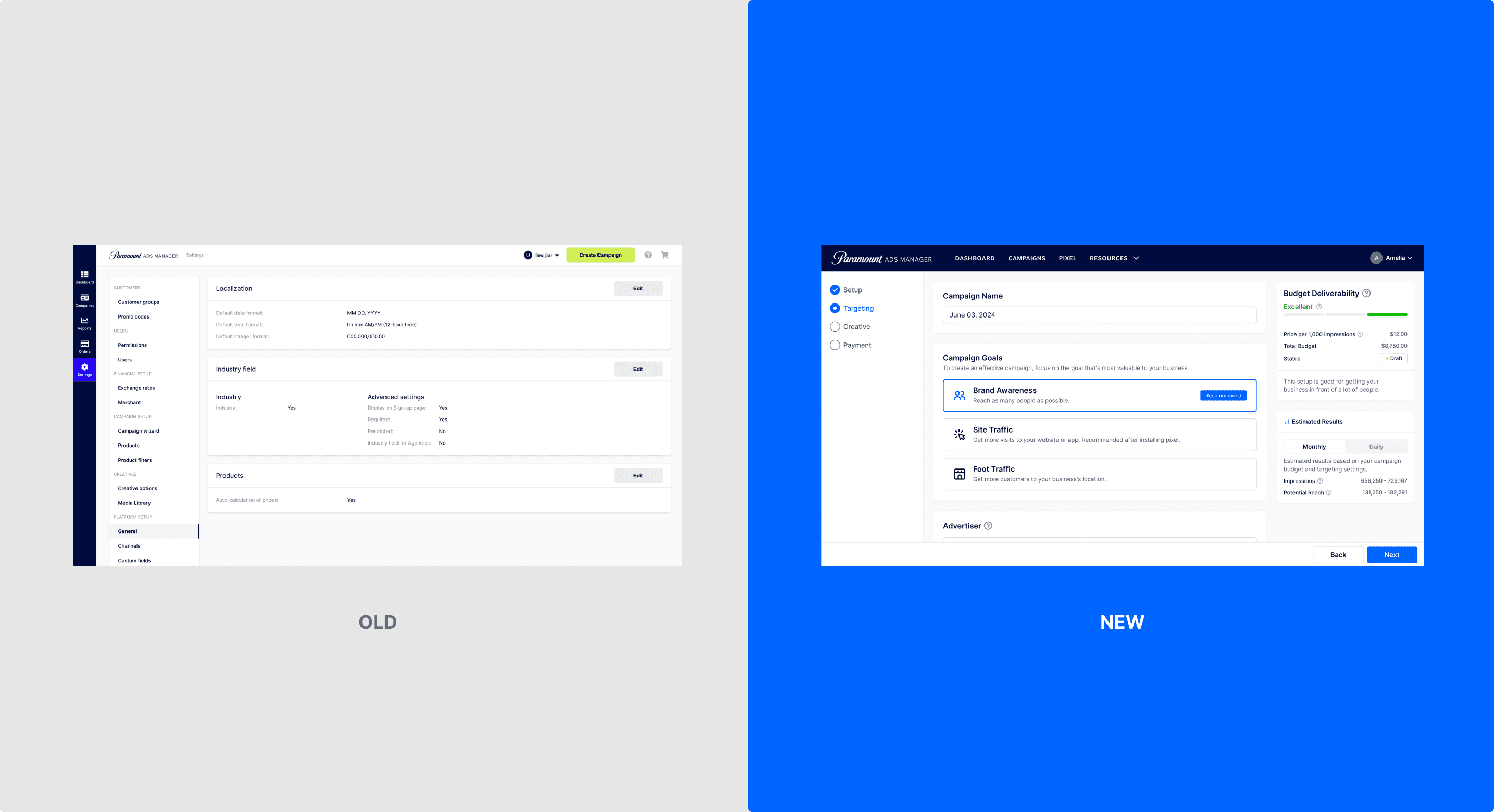
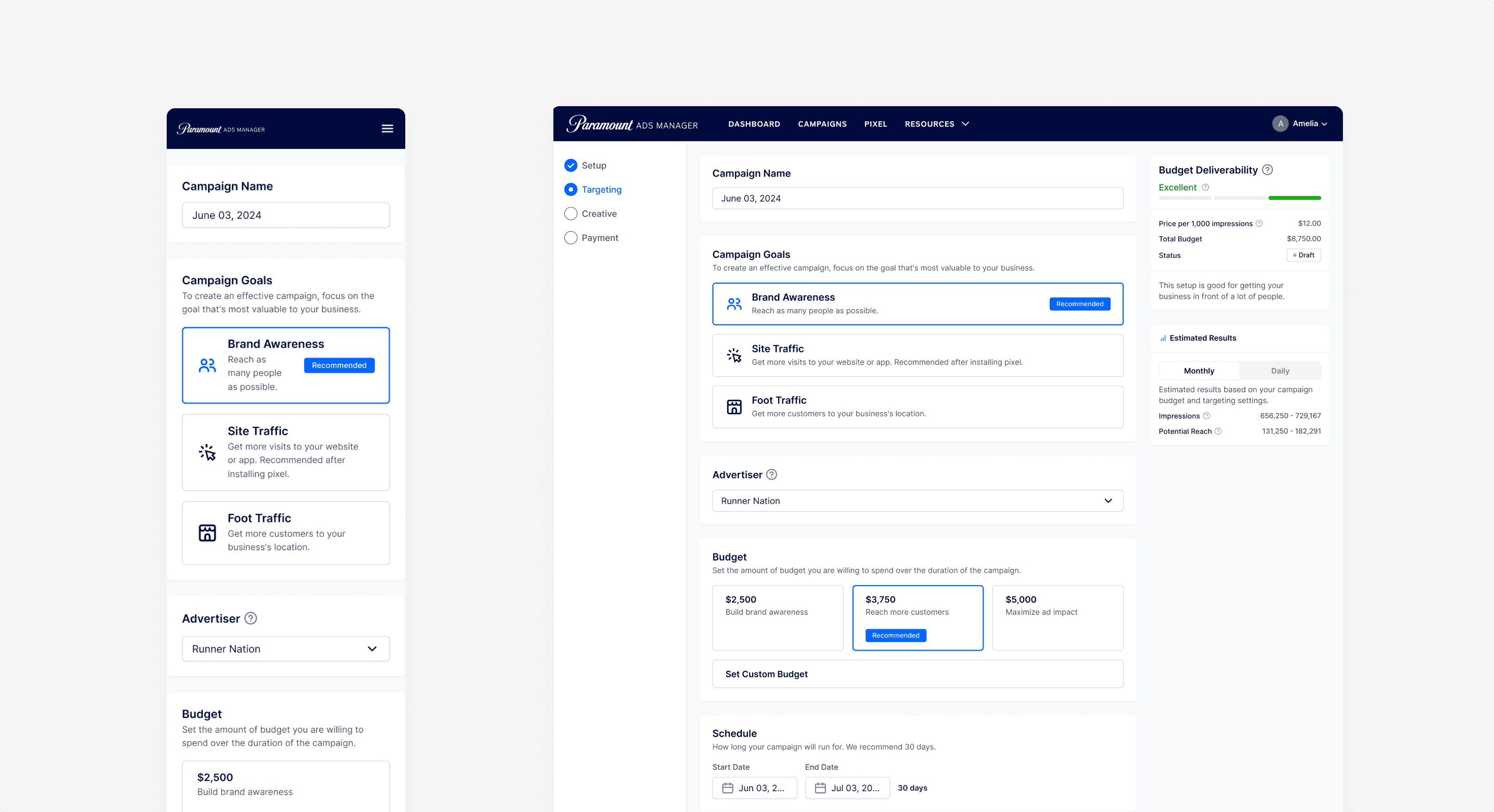
With priorities established, we focused on consolidating and simplifying the campaign creation experience.
We:
Removed redundant steps and merged overlapping flows
Clarified labels, instructions, and helper text throughout the process
Introduced smart defaults—such as preselecting a 30-day campaign duration and recommended budget ranges—to reduce decision fatigue
Ensured every step answered the implicit user question: “Am I doing this right?”
Content played a critical role. Many users arrived feeling stressed and intimidated by the idea of launching a TV ad. By simplifying language and providing contextual guidance, we helped transform the experience from overwhelming to approachable.
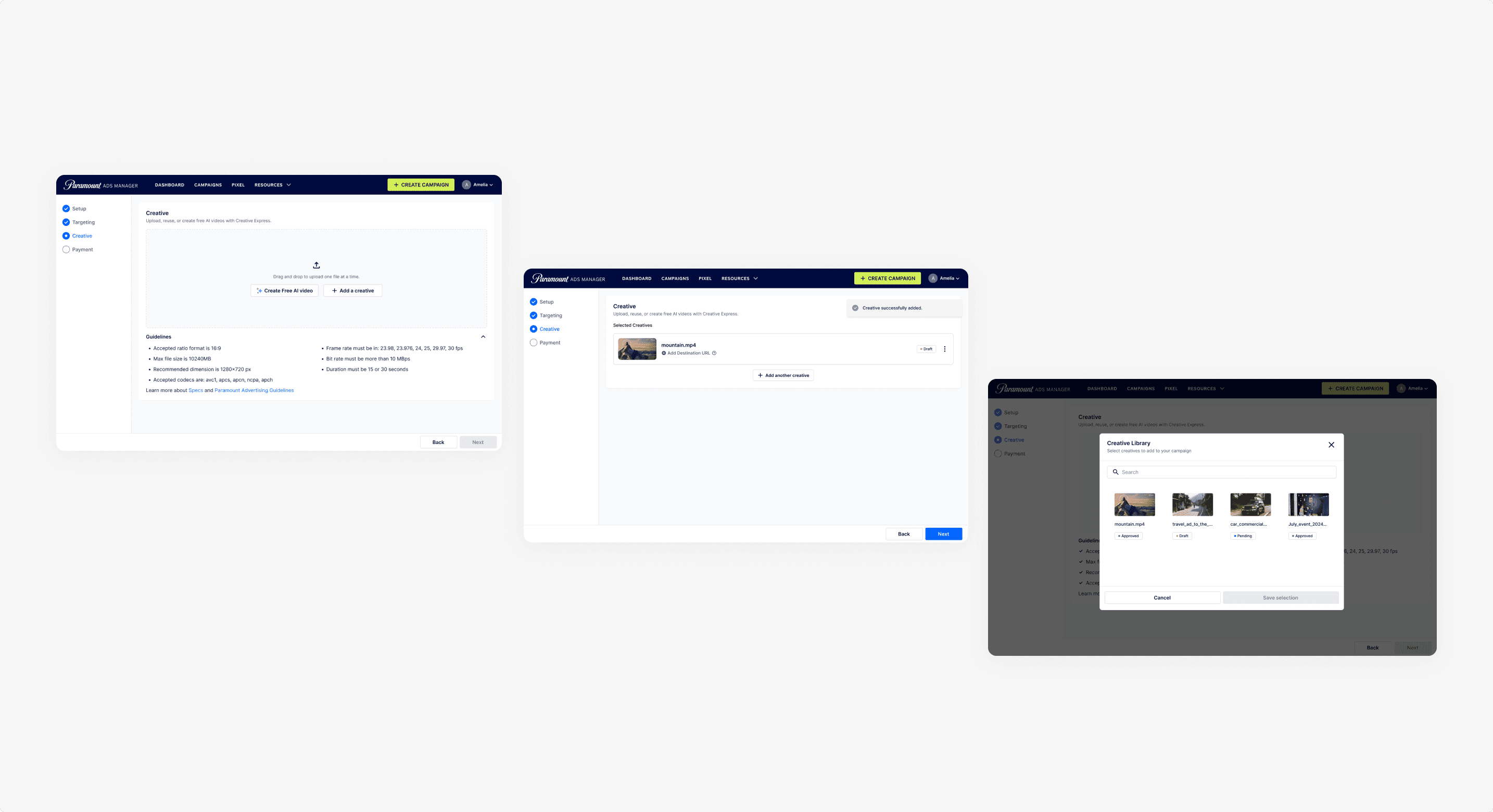
Redesigning the “Add a Creative” Step
The most significant design investment was the “Add a Creative” step.
The existing experience presented too much information at once, offered unclear feedback, and made it difficult to locate previously uploaded assets. As a result, users felt distracted and unsure how to proceed.
Key improvements included:
Clear separation between uploading an existing video and creating one with AI
Stronger visual hierarchy to keep the primary action obvious
Improved feedback for videos that didn’t meet requirements, paired with actionable guidance
Support for selecting and managing multiple creatives
Better visibility into previously uploaded assets
Historically, the platform prioritized desktop experiences—an industry-wide norm based on the assumption that advertisers would upload video files from a computer.
However, analytics revealed significant mobile usage. Research uncovered three primary mobile behaviors:
Exploration & learning — users browsing or testing the flow
AI ad creation — users without video assets relying on AI tools
Campaign monitoring — checking performance of live campaigns
The creative step, already the highest drop-off point, was particularly difficult to use on mobile. Navigation and interaction patterns were not optimized for smaller screens, preventing users from completing key tasks.
We redesigned the experience with mobile responsiveness as a core requirement, ensuring advertisers could explore, create, and manage campaigns regardless of device.
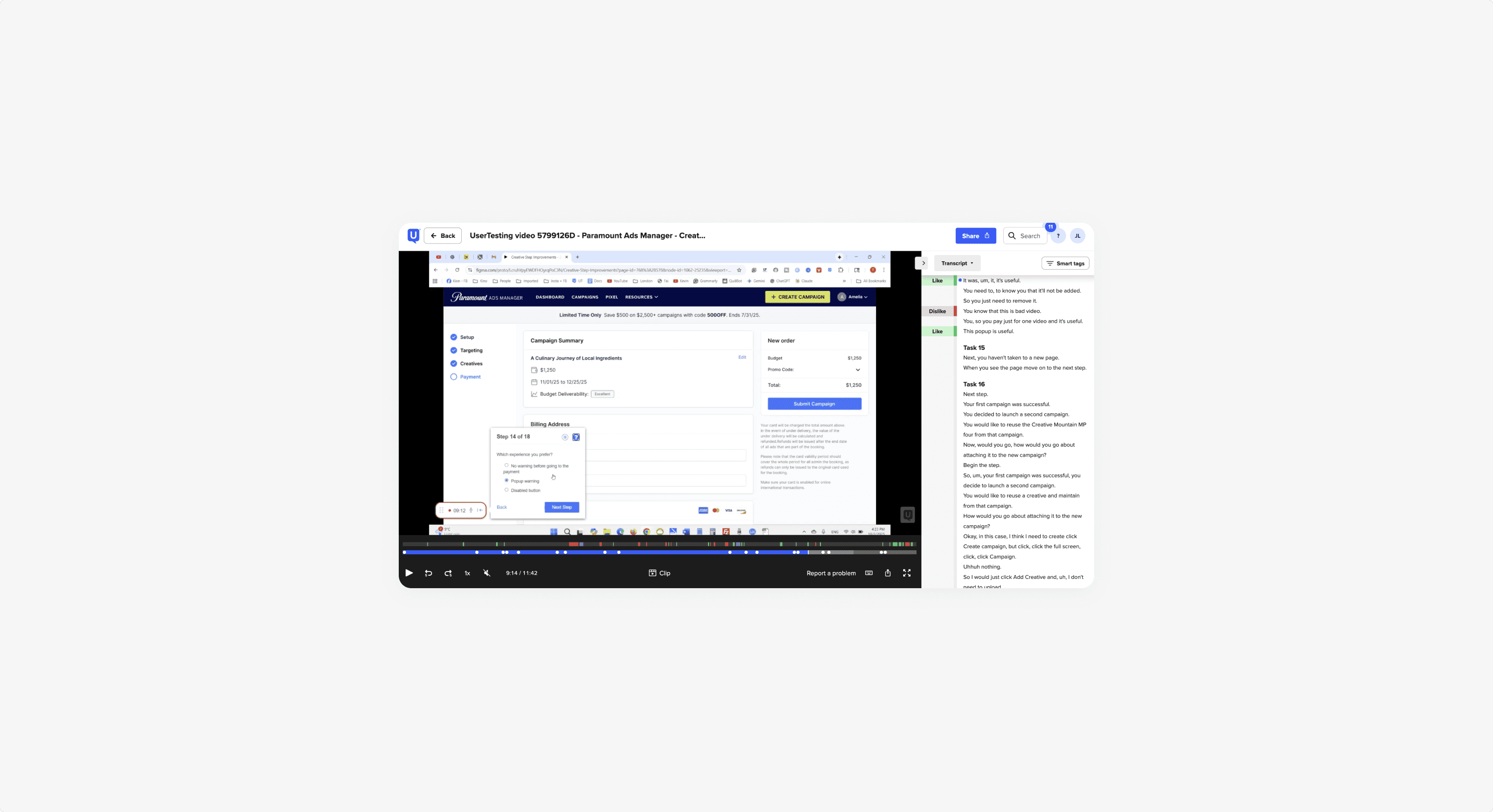
Designs were tested iteratively with:
Internal stakeholders
Sales and Customer Success teams
A select group of SMB advertisers
We validated usability, clarity, and efficiency across both desktop and mobile.
Key insights:
Users found the campaign flow easier to understand and navigate
Mobile participants were significantly more successful completing AI ad creation
Fewer clicks were required to complete a campaign, with higher reported confidence
These improvements streamlined campaign creation, reduced friction, and helped advertisers make more informed decisions.
Key Results
Reduced time to checkout through clearer guidance and fewer steps
Decreased clicks-to-completion, improving overall efficiency
Increased customer satisfaction, based on qualitative feedback and Customer Success insights
Creative Step Optimization (Early Results)
In controlled testing, the redesigned “Add a Creative” step showed strong early impact:
~24% increase in creative step completion
Increased adoption of AI-generated ads
Improved mobile completion rates
These updates are being finalized for public release, with additional refinements planned post-launch.