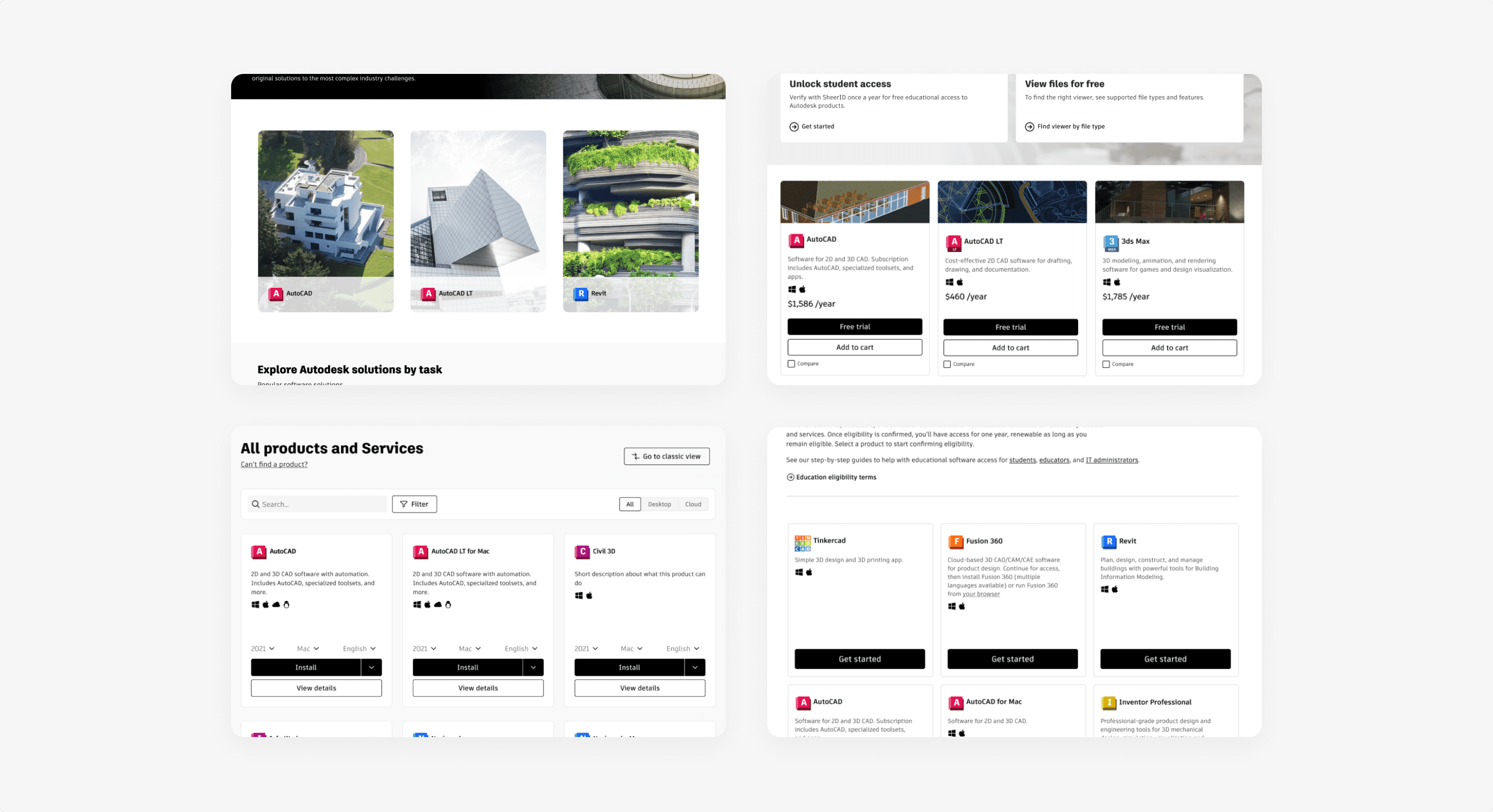
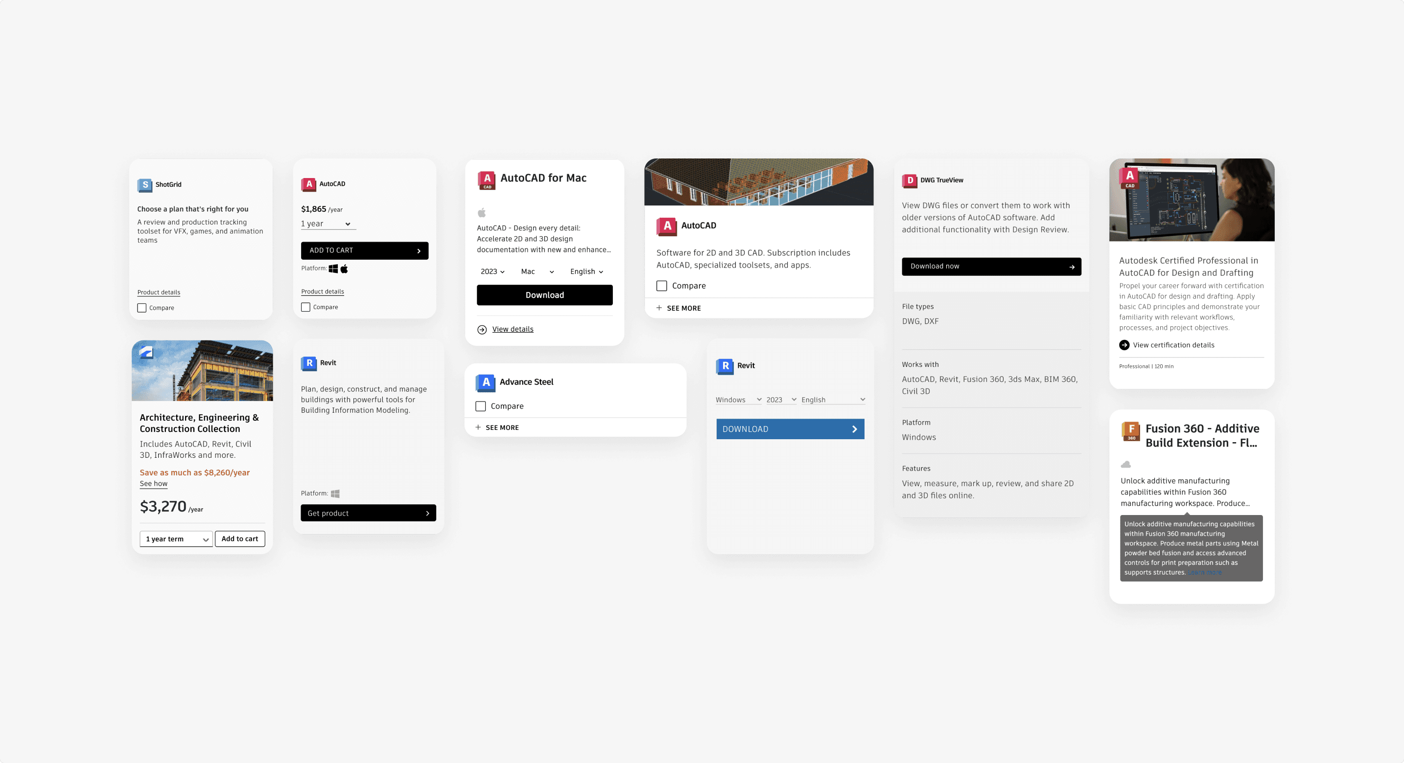
Autodesk offers a range of software across industries such as design, engineering, and entertainment. To help customers understand our offerings, product cards are used throughout the site to highlight key information effectively. However, one-off product cards had been created across the site, leading to inconsistencies. With different teams managing different product cards, updates had to be implemented multiple times across teams, creating unnecessary duplication of work.
At the time, Autodesk’s design team was beginning to establish a design system to create greater consistency and scalability across its products and experiences. As part of this effort, I was tasked with creating a reusable product card pattern that could be adopted across the site.
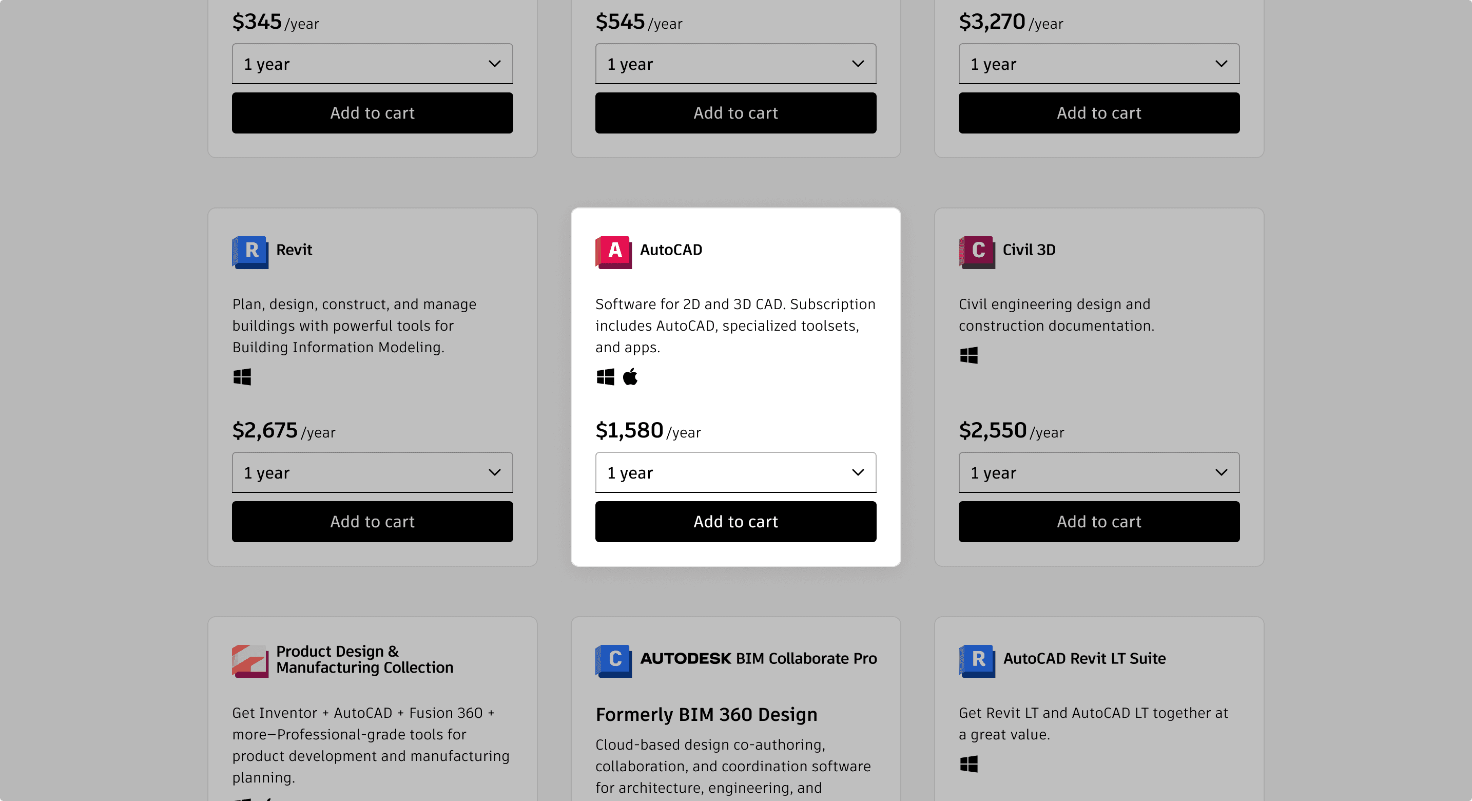
The product card was both a design-system challenge and a product-discovery challenge. I was the primary designer for the team responsible for Autodesk’s product listing page—the main destination for browsing the company’s 100+ products. Because customers needed to scan and compare a large number of products, the card needed to work especially well in this experience while remaining flexible enough to support other areas of the site.
My goal was to create a consistent design with enough flexibility to support diverse use cases, while making it easier for teams to maintain and update product cards as the system evolved.
Because the product card needed to work across the site, I first needed to understand how different teams were using cards and what requirements the pattern would need to support.
Different areas of Autodesk’s website were owned by different teams, each with their own product card needs and requirements. I was the primary designer for the team responsible for the product listing page, the main destination for browsing Autodesk’s 100+ products. Because the page required users to scan and compare a large number of product cards, consistency and scannability were especially important.
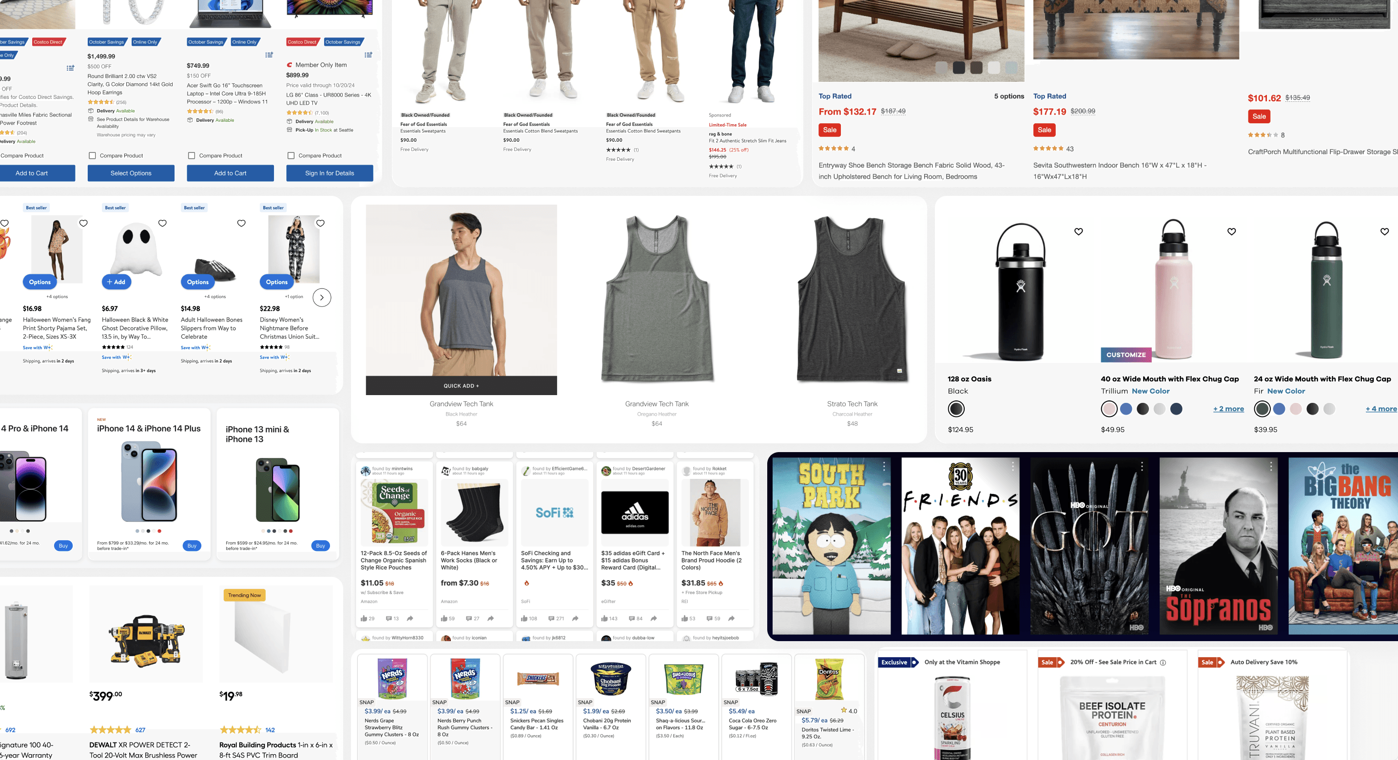
To understand what a universal product card needed to support, I interviewed stakeholders across teams to identify their requirements, use cases, and priorities. I also audited existing product card variations, conducted a competitive analysis to understand common patterns and user expectations, and partnered with SEO, Customer Insights, and Data Analytics to understand content requirements and how users navigated the site.
This research helped me identify which elements needed to remain consistent across the system and where the design needed enough flexibility to accommodate different team and product needs.
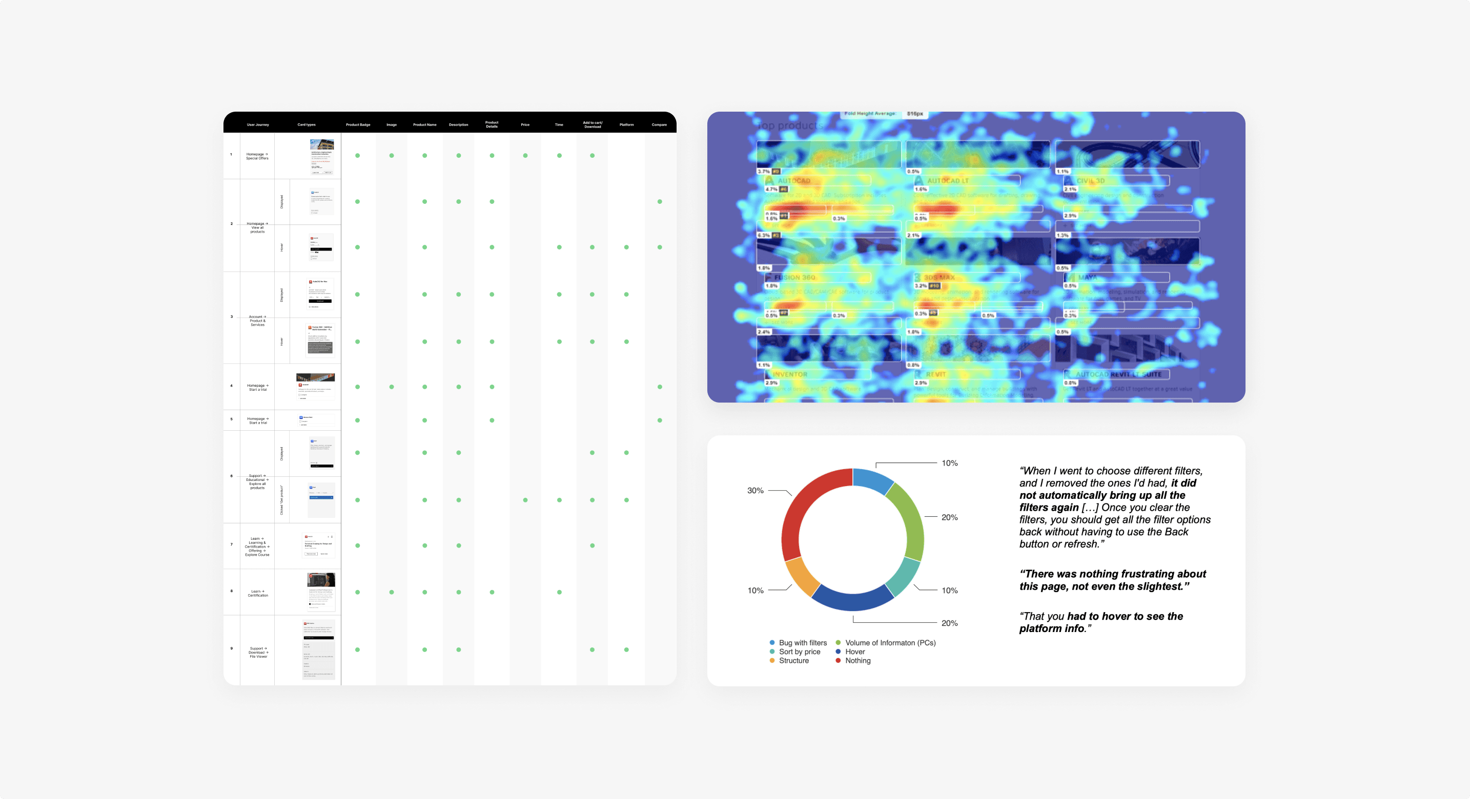
To understand what information was most important within the product card, I used workshops to bring different perspectives into the process.
Understanding customer needs
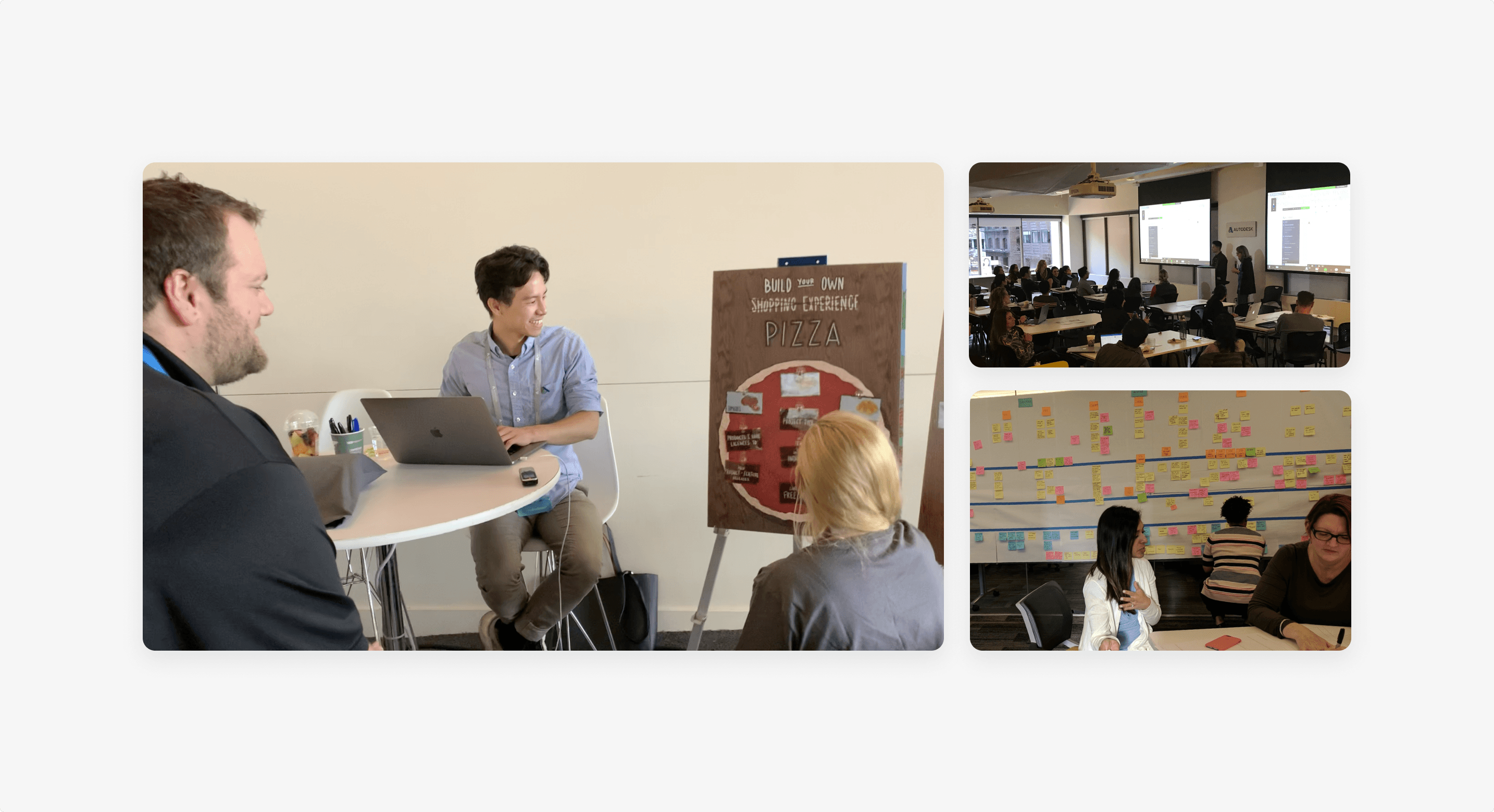
I facilitated customer workshops to explore how users evaluated products and what information they needed to make decisions. For the product listing experience, customers placed particular importance on price transparency and the ability to compare products when scanning through Autodesk’s product offerings.
Aligning stakeholders
I also facilitated stakeholder workshops to understand the requirements across different areas of the site. While specific needs varied by context, calls-to-action (CTAs) were a consistent priority—whether the goal was to purchase, download, or learn more about a product.
Rather than gathering requirements and aligning with each team separately, I used these workshops to bring stakeholders together in the same room. This created a space to discuss requirements, resolve differences, and make decisions collectively, reducing back-and-forth communication and ensuring that everyone had a voice in shaping the product card pattern.
These sessions helped establish which elements should remain consistent across the system and which needed to be flexible depending on the context.
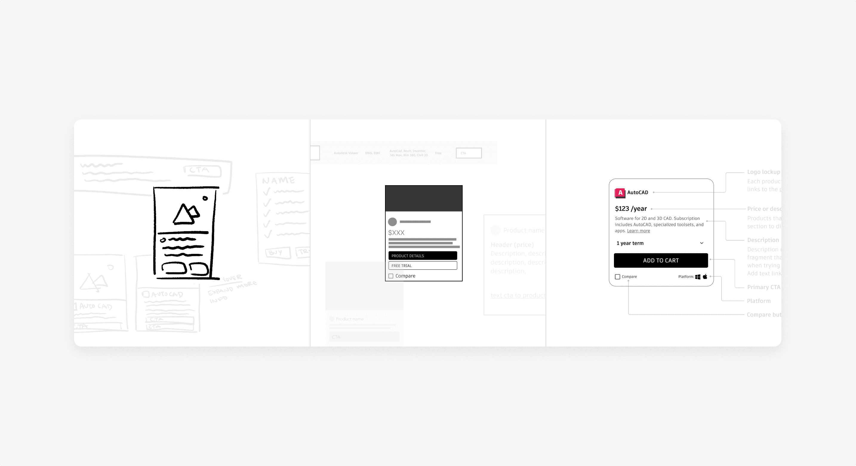
With the research and workshop insights as a foundation, I began exploring different directions for the product card, starting with low-fidelity concepts and gradually refining the designs.
Rather than waiting until the designs were finalized, I tested ideas throughout the process. I explored different configurations for the card, testing the hierarchy, content density, and placement of key actions as I refined the pattern.
I worked closely with researchers to conduct both qualitative and quantitative testing. Usability testing helped us understand how users interpreted and interacted with different card elements, while behavioral data helped validate those findings at scale.
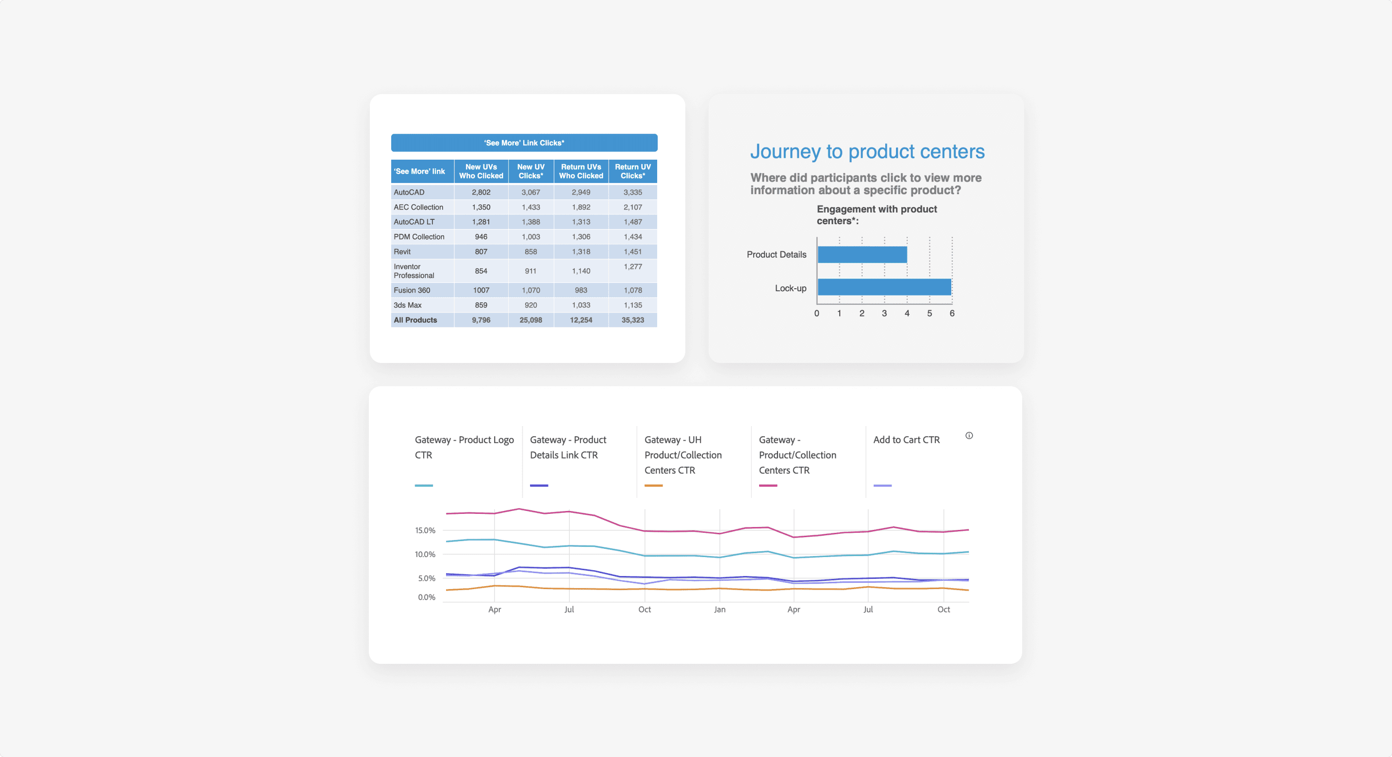
One example was the CTA. Our data showed that users were more likely to click the product logo than the CTA when accessing a product’s landing page.
This raised a question: Was the CTA actually helping users, or was it simply adding another element to the card?
We explored removing the redundant CTA and A/B tested the simplified design. The test showed no drop-off in traffic to product pages, while usability testing confirmed that users still understood how to access the product.
This iterative process helped us distinguish between elements that were genuinely useful and those that added unnecessary complexity, ultimately informing a simpler and more flexible product card pattern.
Once the pattern was validated, I worked with a content strategist to define guidelines for how and when the product card should be used. We documented the different configurations, content requirements, and usage principles to give teams clear guidelines while still allowing flexibility for different contexts.
I then partnered with the design system team to bring the pattern into the system, making it available as a reusable component. This gave teams a shared foundation for building product cards, reducing one-off solutions and making future updates easier to manage.
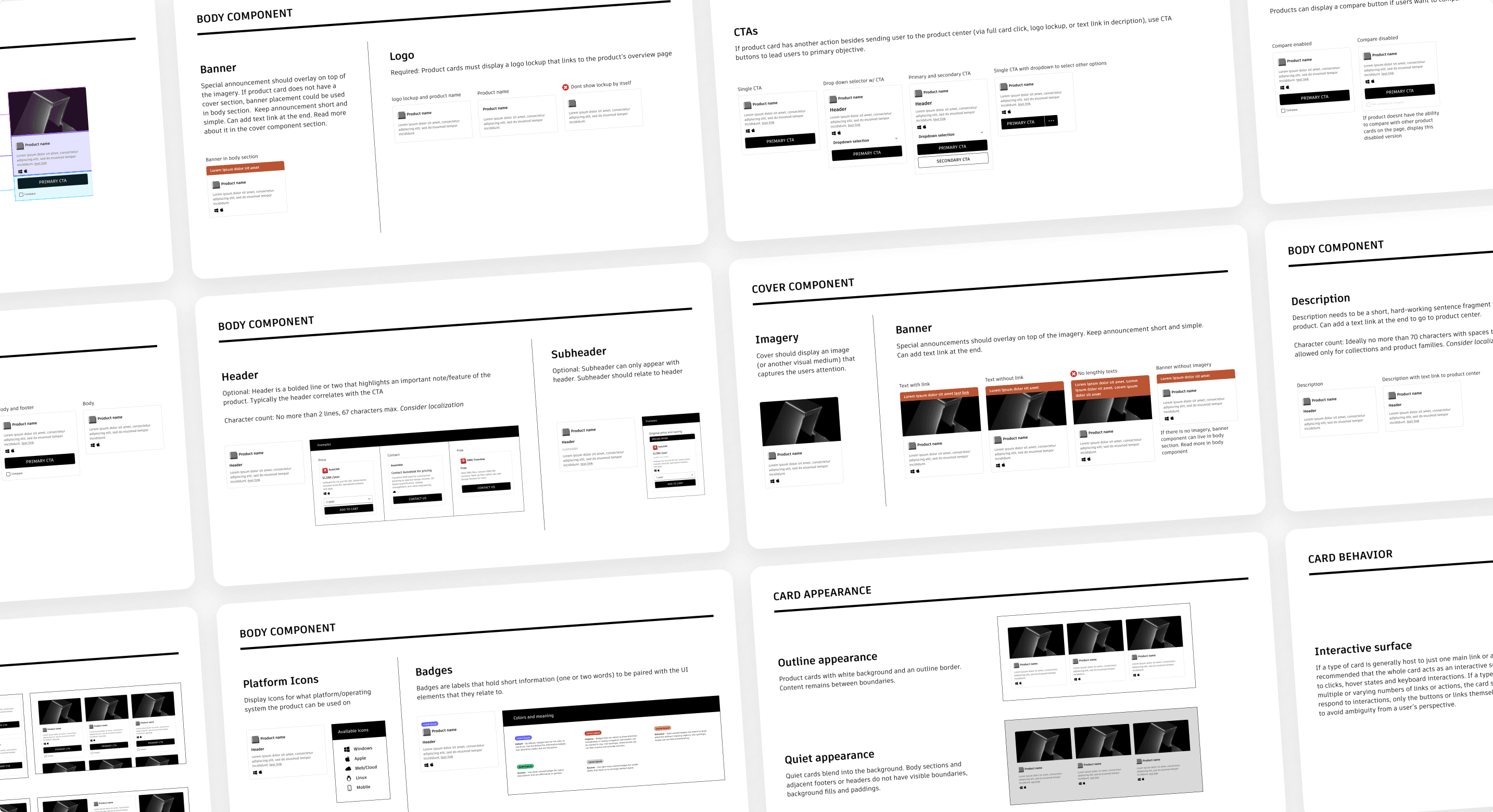
The new product card pattern replaced one-off solutions with a flexible, reusable component that teams could adapt while maintaining a consistent experience across the site.
As part of the design system, internal teams could create and update product cards without relying on engineering for manual implementation, making it faster and easier to launch new experiences while reducing duplicated work.
The impact was especially visible on pages that heavily relied on product cards. The product listing page saw a 27% increase in engagement with product centers, helping more customers discover and explore Autodesk’s products.